Skip to content
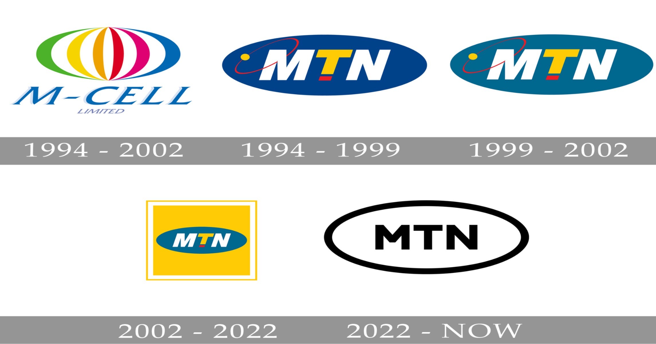
MTN’s logo evolution is more than just a change in design—it’s a reflection of the brand’s growth, adaptability, and commitment to staying relevant in a fast-paced world. From its humble beginnings to becoming a global telecommunications giant, MTN has consistently used its logo to communicate its values and vision. Let’s dive into the fascinating journey of how MTN’s logo has evolved over the years and what it means for the brand today.
The Early Days

When MTN launched in 1994, its logo was simple yet impactful. The bold yellow and white design symbolized optimism and connectivity, core values for a company entering the telecommunications space. The logo featured the iconic “MTN” text with a swoosh-like underline, representing movement and progress. It was a clear statement: MTN was here to connect people and drive change.
This initial design laid the foundation for what would become a series of strategic updates. As MTN expanded across Africa and beyond, the logo needed to evolve to reflect its growing influence and global presence.
The Shift to Modernity: A Sleeker, More Dynamic Logo
By the early 2000s, MTN’s logo evolution took a significant turn. The company introduced a more streamlined design, ditching the underline for a cleaner, more modern look. The yellow remained, but the font became sharper, and the overall design exuded confidence and sophistication.

This change wasn’t just about aesthetics—it was a strategic move to align with MTN’s mission of innovation and excellence. The new logo resonated with a younger, tech-savvy audience while maintaining the trust of its existing customer base.
MTN’s Logo Evolution: Embracing Digital Transformation
In recent years, MTN’s logo evolution has mirrored the brand’s embrace of digital transformation. The latest iteration features a gradient yellow design, symbolizing energy, dynamism, and forward momentum. The font is bolder, and the overall look is optimized for digital platforms, ensuring it stands out on screens of all sizes.
This evolution reflects MTN’s commitment to staying ahead of the curve. The logo isn’t just a visual identity; it’s a representation of the brand’s ability to adapt and thrive in an ever-changing digital landscape.
What MTN’s Logo Evolution Teaches Us About Branding
MTN’s logo evolution offers valuable lessons for businesses looking to refine their brand identity. First, consistency is key. While the design has changed, the core elements—like the color yellow—have remained, ensuring brand recognition. Second, evolution should be purposeful. Each update to MTN’s logo was driven by a clear strategy, whether it was expanding globally or embracing digital transformation.
Finally, a logo should tell a story. MTN’s logo isn’t just a symbol; it’s a narrative of growth, innovation, and connection.
Mia Family: The Pioneers Behind Waterfall City
MTN’s Logo Evolution as a Symbol of Progress
MTN’s logo evolution is a testament to the brand’s ability to adapt and innovate while staying true to its core values. From its early days to its current digital-forward design, the logo has been a powerful tool for communicating MTN’s mission and vision. As the brand continues to grow, its logo will undoubtedly evolve further, reflecting new milestones and achievements.
For businesses, MTN’s journey is a reminder that a logo is more than just a design—it’s a living, breathing representation of your brand’s story.
Get the latest entrepreneurial success stories, expert tips, and exclusive updates delivered straight to your inbox — Sign up for Entrepreneur Hub SA’s newsletter today!